Primark

Simultaneously, we worked to demonstrate the effectiveness of a lower ambient light level

Client
Primark
Location
UK & International flagship stores
Manufacturer
Reggiani Lighting, iGuzzini Lighting, Unibox, Moooi, LED Linear
Suppliers
Architectural FX
Architect
3D Architects Ltd (now Prosper), Gensler, HMKM, Dalziel & Pow, TTG Architects, Jack Coughlan Associates
Awards
Guinness world record – Largest fashion retail store | Winner of Drapers Awards 2019 – Best store design (over 50,000sqft) | Winner of Drapers Awards 2019 – Fashion retail business of the year (over £500M turnover) | Winner of Revo Gold Awards 2019 – Re:purpose category | Winner of Revo Gold Awards 2019 – Re:turn category | Shortlisted Retail Week Awards 2020 – Store of the year large format | Shortlisted Retail Week Awards 2020 – The Hemes customer experience – game changer
Over the last 10 years, LAPD has researched, designed and developed the lit environment for Primark. In doing so, we have created vibrant lighting schemes to complement their ever-evolving store identity.
From a flat, 2000 lux average, we have simultaneously reduced wattages, lamp and luminaire types and ambient levels. As a result, we created cleaner and more efficient schemes, with increasing levels of drama and identity.
Culminating in a series of European flagship stores, Primark’s lit environments are now as dramatic and exciting as the stores they light.
The Beginning
We began at their Oxford Street store, where we researched their existing flagship retail lighting design. The lighting, heavily influenced by product aesthetics and convenience, was based on trial and error. A highly visible part of the store environment, the lighting created an overlit, flat environment. An extensive specification with many different lamp types complicated maintenance, procurement and cost schedules.
The learnings we took from here informed our recommendations for a trial store in Tooting.
Tooting
Our first step was to dramatically reduce the breadth of the specification, reducing the number of lamp types by 50%.
Simultaneously, we worked to demonstrate the effectiveness of a lower ambient light level. The trial store at Tooting featured dimmable fluorescent fittings above walkways and sales floor. Through the use of the dimmable fitting, we reduced the ambient level by 50%. This allowed the accent lighting layer to appear, consequently highlighting merchandise and graphics. In conjunction with the lower ambient light level, we were able to reduce the wattage of the accent lighting. Dropping from 70W to 35W across the main sales floor saved a huge amount of energy. We ensured that light output would not be sacrificed, using high performance reflectors which boosted light output ratios.
Perimeter lighting also saw a 50% reduction in wattage, from 150W to 70W. The vertical surfaces of the perimeters were markedly brighter than the main floor. Although this gave the perception of a brighter space, the new optics created contrast, making it more dramatic and exciting.
While these changes reduced ambient levels and energy consumption, we made minor adjustments to luminaire spacings. The result was a 13% reduction in luminaire quantities. The broader picture, however, was the creation of a dynamic lit environment. Punchy accent lighting, overlaid over an appropriate, 1200 lux ambient level, revolutionised Primark’s store design. This became the basis of all future Primark lighting schemes.
Birmingham
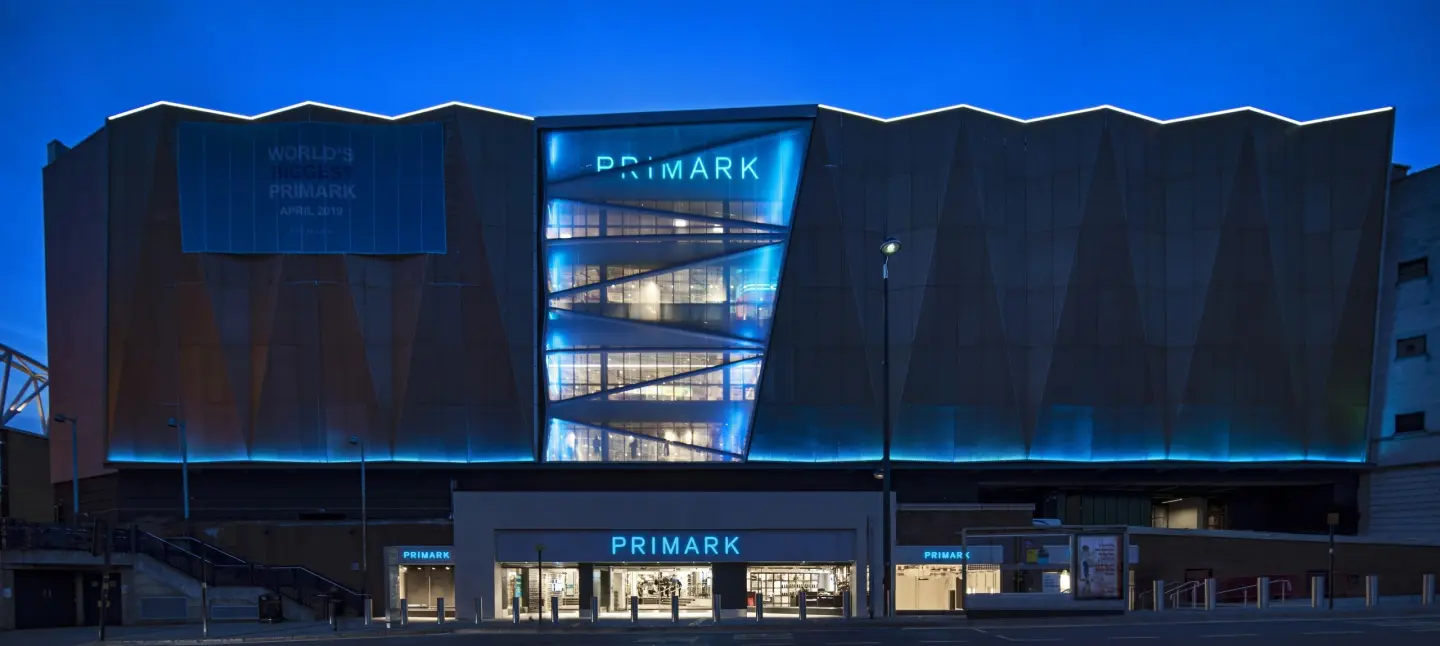
On the 11th of April, 2019, Primark opened their new store on Birmingham High Street. This new Primark occupies the former Pavillions Shopping centre, originally housing 49 shop units and a food court, and is set across five trading floors. As a result, measuring 160,000 square feet, the premises holds the Guinness World Record for Largest Fashion Retail Store.
The store is located between two travel hubs, and this had to be taken into consideration at the design stage. RGBW illuminated ETFE pillows, above both entrances, demarcate the route through the store, thus creating a shortcut for commuters and a unique shopping experience. Primark Birmingham is home to a number of in-store experiences. These include the Primark Beauty Studio, the Mills x Primark barber, and three food and beverage offerings
An LED specification reaped the benefits of better energy and, similarly, maintenance savings. The foundation of the cost-effective system lies in the use of suspended track within exposed ceilings. A white finish throughout meant the lighting could blend into the neutral background. Consequently this creates no distinction or disruptions and, therefore, gives flexibility to the space. This allows the store to easily cope with its ever-changing merchandising layouts.
Narrow and medium beam spotlights provide contrast. with an undulating lit environment. In addition, a grid of pendants, with wide beam optics, provide background ambience. This makes a predominantly accent driven scheme more forgiving and manageable.
This sustainable and effective system perfectly accents merchandising, and allows the store interior to shine.
Throughout the store visual interest is high with the use of integrated lighting. Within the space, the lighting is dedicated, above all, to the merchandise. Consistent, self-illuminated graphics and signage perfectly highlight stock.
LAPD expressed architecture and key areas are with light. Two large atria separate the store’s central avenue, which connects the front entrance to the back. We framed the atrium apertures with lines of light, to boost ambient levels below. Replicating this through multiple floors helps to enhance the geometry and height of the spaces. The transition through several floors was key, with continuous lines of light beneath each escalator connecting the atria, therefore aiding navigation.
The exterior envelope was unique to its location, therefore requiring a bespoke solution to deliver maximum impact.
The new metal façade is now easily recognisable on Birmingham’s high street. A double-layered, expanded, metal mesh forms gigantic geometric facets. Optically controlled linear LEDs graze the structure, meanwhile, creating interest using light and shadows.
The RGBW grazer enhances the perforation texture, which creates a beautiful moiré effect as bystanders walk past the façade. This phenomenon provides a subtle dynamism to a static entity.
Berlin
Following further improvements to the lighting of their UK stores, Primark asked us to work on their new European flagships, starting with Berlin in 2013 alongside Dalziel + Pow. With a local narrative running throughout, the store required a series of unique elements within the lighting scheme.
With a predominantly open ceiling, a new array of track and spotlights gave the store maximum flexibility. Finished in black so as to disappear into the dark ceiling space, the spotlights featured narrow and medium beams to create a balance between punchy accent light and forgiving infill.
A major change from previous stores was the omission of the fluorescent light over walkways. Replacing the ambient array was a recessed trough, painted black internally and fitted with black track and narrow beam spotlights. The removal of ambient light increased contrast and perceived brightness of the adjacent sales floor spaces. At the same time, the narrow spotlights, centred over walkways, gave us opportunity to deliver focussed light to mannequins and displays on the walkway edges. This highlight created a series of gateways to the main sales floor spaces, providing enticing, curated displays of merchandise.
Cast on to the wall within the atrium and vertical circulation space, a bespoke projection mapping of the city is the main element of the local narrative. To ensure safe levels of light on the escalators without detracting from the projection, we specified narrow beam remote-controlled spotlights. Mounted close to the soffit, they did not obstruct the projections, so cast no shadows.
The new lighting in the Berlin store realised a reduction in energy consumption from 55W per square metre to 20W per square metre, yet represented the pinnacle of Primark’s lit environments up to that point.
Dusseldorf
Running in tandem with the Berlin scheme, Dusseldorf’s flagship received a different unique feature – the Trend Room. Here, mannequins dressed with the latest in Primark’s product lines are showcased beneath LED backlit ceilings and narrow beam spotlights. Dusseldorf received the same sales floor and walkway lighting as Berlin.
Köln & The Hague
Köln and The Hague were the next high-profile stores for Primark, in 2014. The stores featured massive storefront enhancements and a radical new feature luminaire concept above escalators, respectively. They expanded on previous store concepts, introducing deeper levels of control and increasing the usage of LED sources within the sales floor environments.
Brussels
In 2015, Primark opened their first small footprint, “boutique” store in Brussels. Due to the scale and format, we were able to implement an all-accent scheme for the main sales floor. While previous walkways were without dedicated lighting, the strong linearity of this one required a defining light treatment. Dimmable LED battens set at different angles create a wave form, suspended above the walkway and animated via DMX control.
Madrid
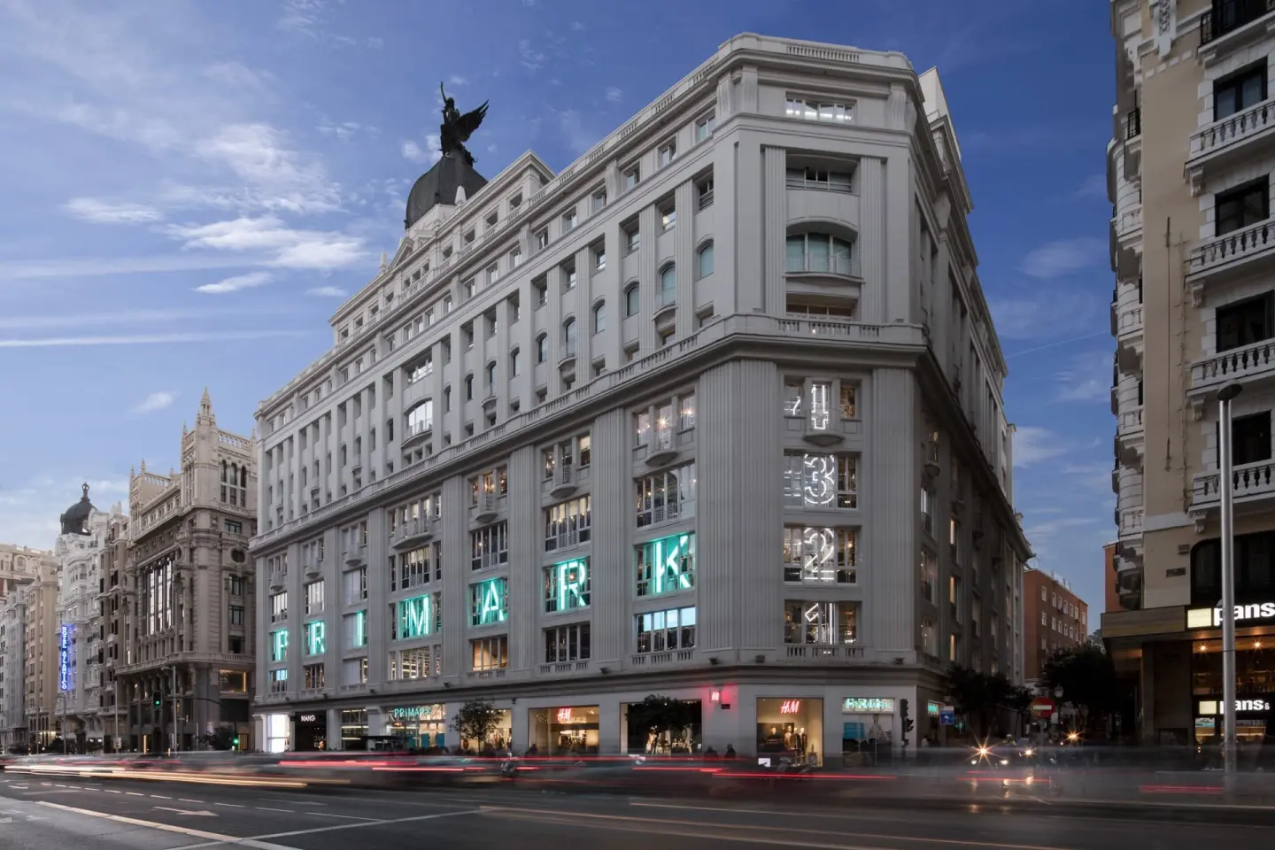
In 2015, Primark Gran Via launched on Madrid’s premier shopping street. Restoring Madrid’s first department store to beyond its former glory, the Gran Via scheme marked a number of changes in the lighting scheme. Firstly, the array of track was designed in direct response to the architecture. The sales floor envelopes a huge octagonal atrium and the track layout echoes the resulting shapes on the sales floor. With low ceiling heights throughout, we used smaller track-mounted luminaires than in previous stores. Again using a mixture of narrow and medium beams and 35W metal halide, these were supplied in white or black, depending on their location within the store.
As the premises is a Listed Building, Spanish Heritage became heavily involved with all aspects of the design. Due to the regulations around emergency lighting, LEDs account for 30% of the luminaires. These allow for instant light in the event of an emergency. These LEDs, supplied from the same range of luminaires, give a holistic aesthetic to the lighting layout.
The store was heralded upon launch and went on to win a slew of awards, including the 2017 Euroshop Awards Retail Design Award; 2017 Retail Design Awards Best Overseas UK Store Launch; and the ISG Retail Interior of the Year award.
Boston, USA
Beyond the landmark Gran Via store, Primark ventured into the United States, opening their first US flagship in the former Filene’s building in Boston. Taking lessons from the European flagships while adhering to strict US guidelines and UL certification, the Boston store was a unique addition to the lively Boston retail scene. An immediate success, the Boston store was the first of 9 American Primark properties.
More Projects