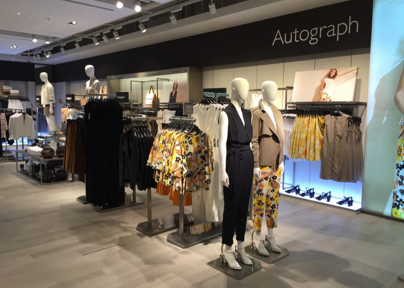
While the changes to optics made very visible improvements, the lamp wattage was an equally important step for M&S. The new 35W lamps, driven by more efficient control gear, halved the energy consumption of the accent lighting. This would prove to be a hugely important step for M&S’s future.
To clean up the store perimeter, we moved away from the antiquated pelmet lighting. To replace the lit effect, we used overlapping linear fluorescent on top of the wall panelling to uplight the walls. The uplight spanned between the top of the panelling and the ceiling, boosting visibility of the perimeter. The ribbon of light altered the perception of the store, immediately making it feel brighter. Later replaced with modular LEDs, the linear fluorescent was specified with a 4000K colour temperature. The difference in temperature helped to define the perimeter.
M&S Lighting Design Evolution:
Over the years, M&S mainline store retail lighting has undergone many iterations. Some, such as the modular fluorescent programme, entailed improvements within existing ceilings and layouts, using broadly familiar luminaires to the M&S estate. Others required wholesale change, development of new fittings and a radical departure from what had gone before.
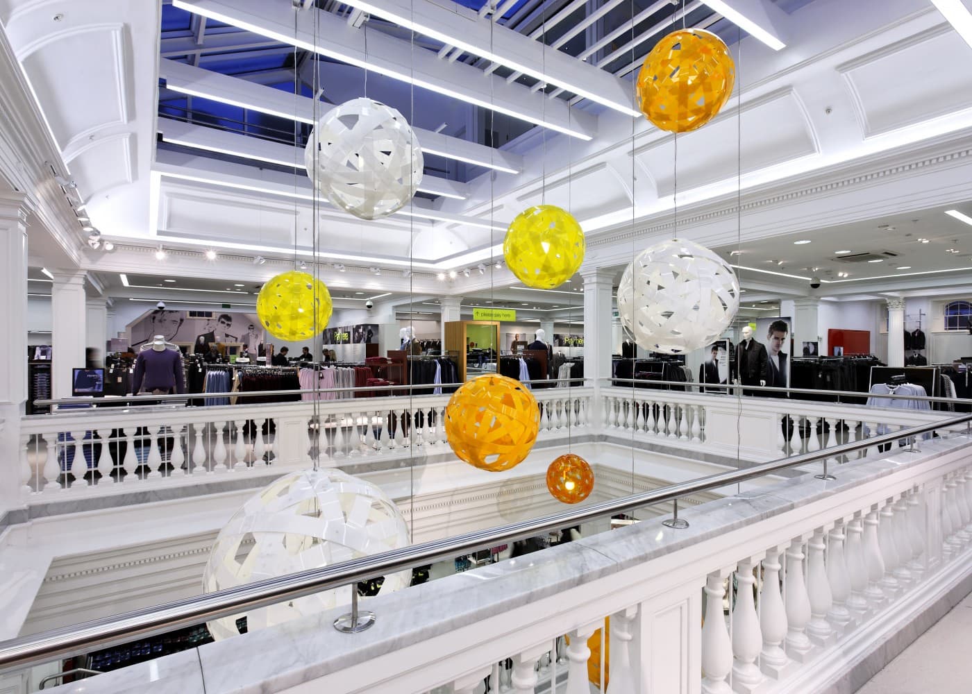
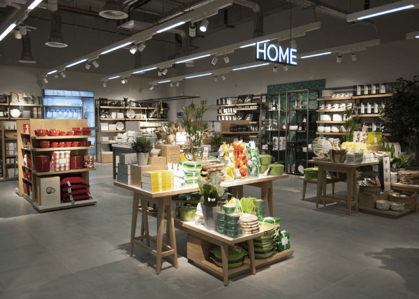
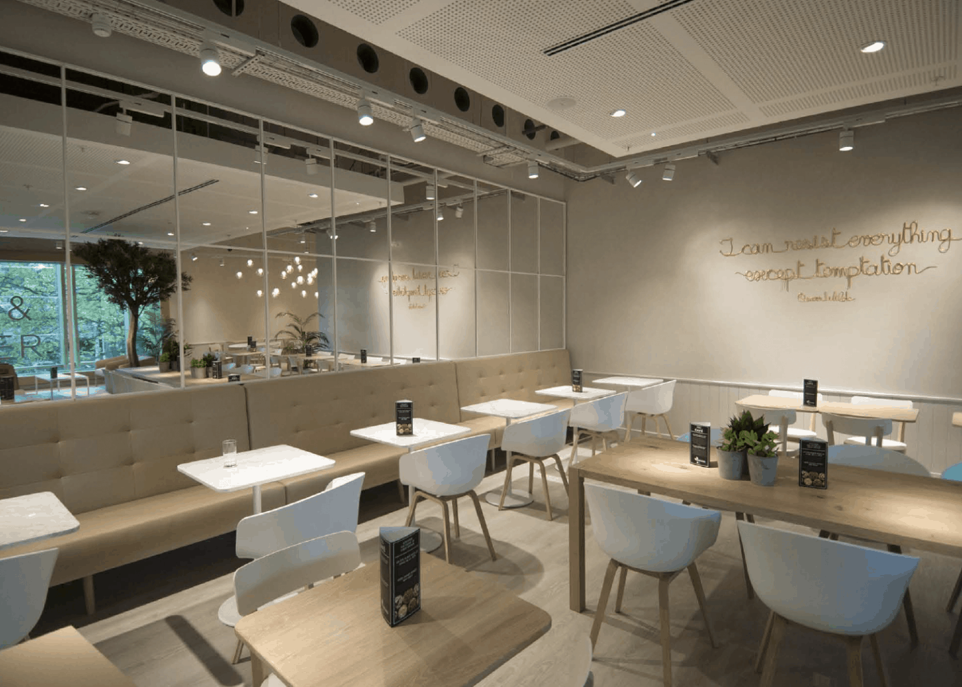
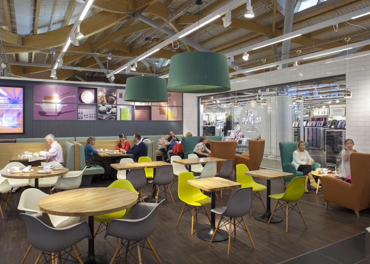
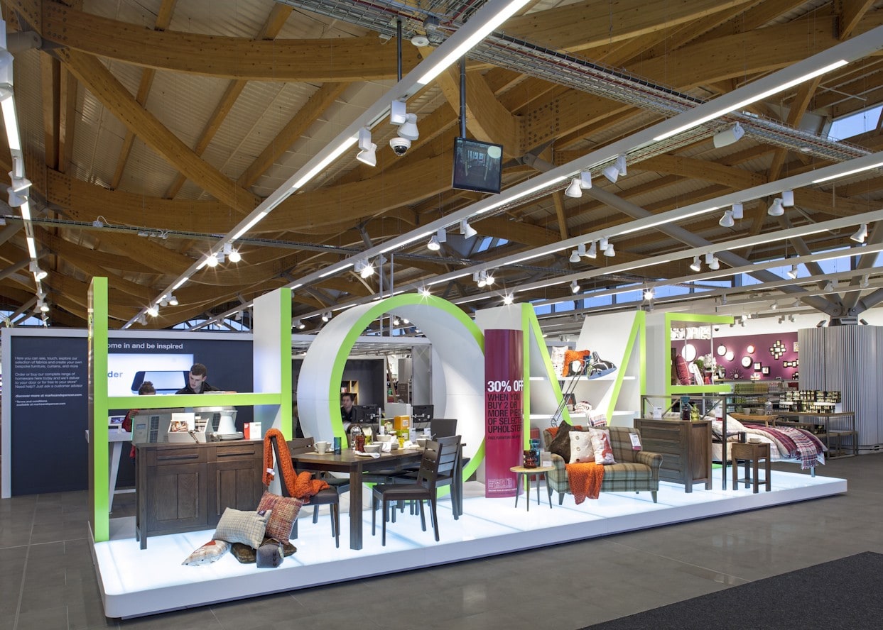
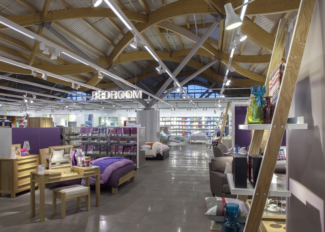
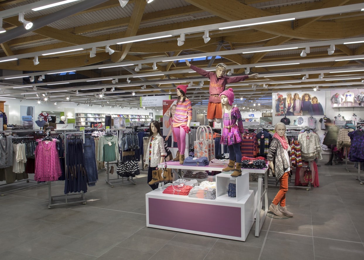
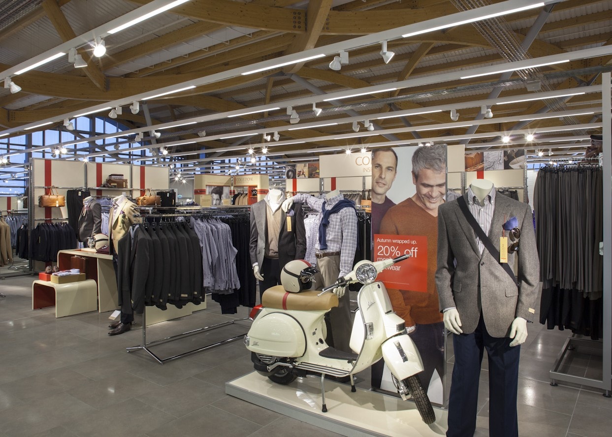
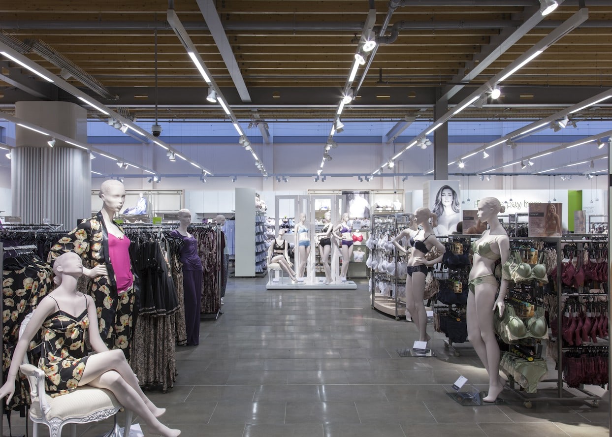
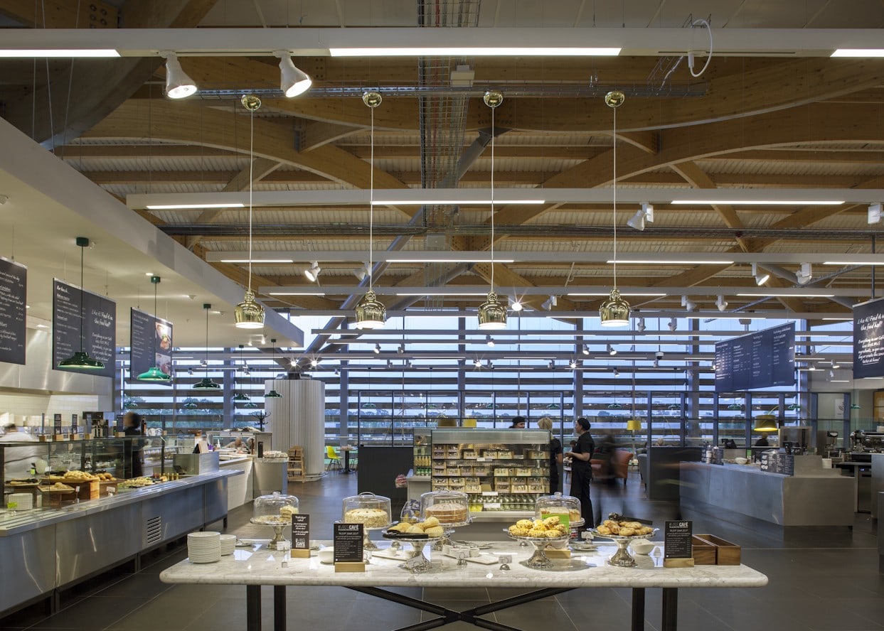
One such change used suspended, modular, linear fittings that incorporated fluorescent ambient light and 3-circuit track for flexible accent lighting. With modules in various lengths, this system allowed us to tailor the lighting to any size or shape of store. By rolling out the same luminaires across much of the estate, it brought a holistic aesthetic to M&S stores. The suspended system worked within all types of store, with any ceiling architecture – open, lay-in grid, tiled or plasterboard. This was especially important as M&S started to move towards larger, out-of-town premises that generally used open ceilings.
Retail park stores such as these benefitted greatly from the suspended lighting. The strong linearity and simple aesthetics of the luminaires helped to draw customers’ eyes away from exposed HVAC services above. At the same time, the ever-improving accent lighting pulled focus on to merchandise and displays. To really emphasise the potential of the accent lighting and realise greater energy savings, the fluorescent component of the system became dimmable.
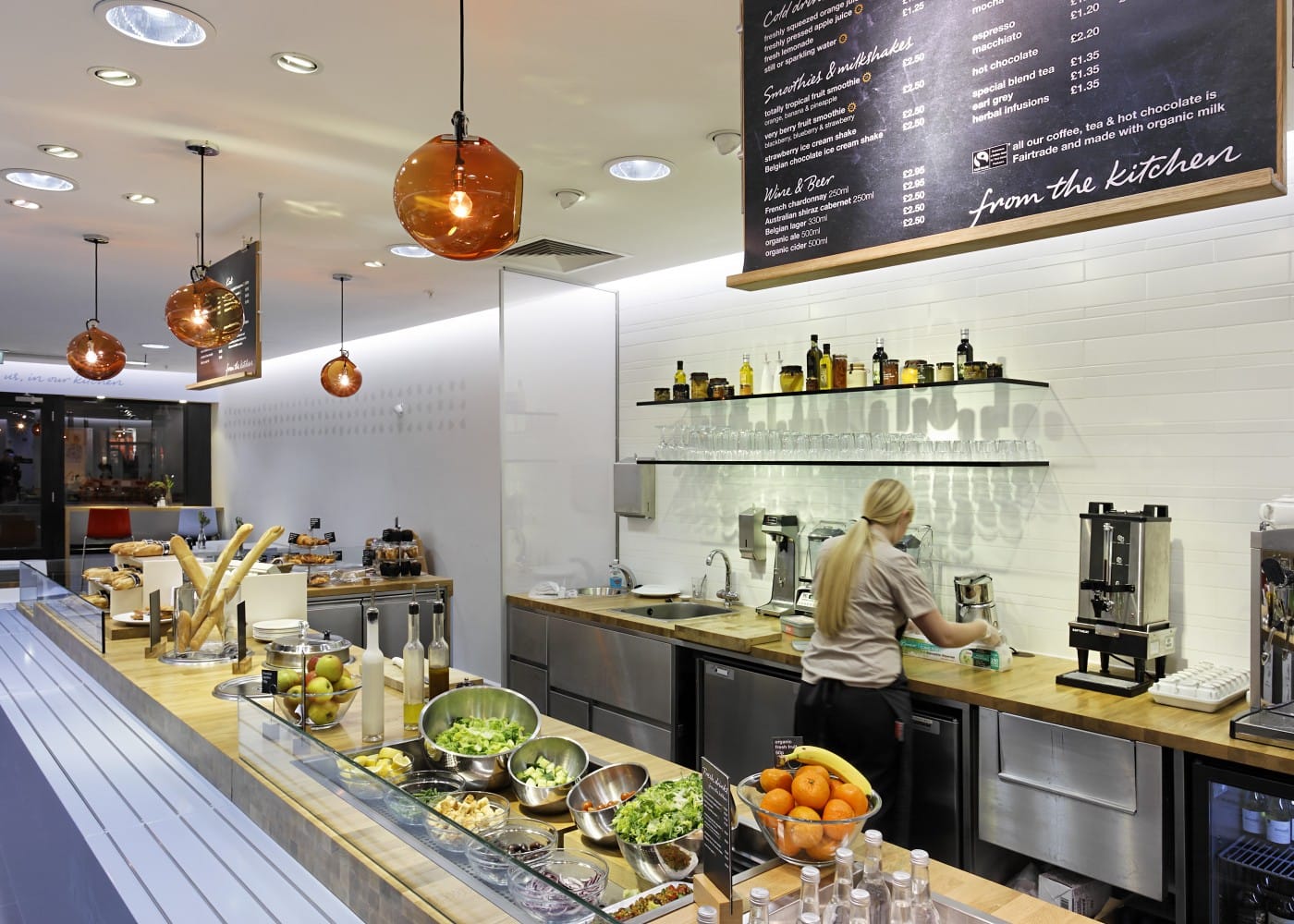
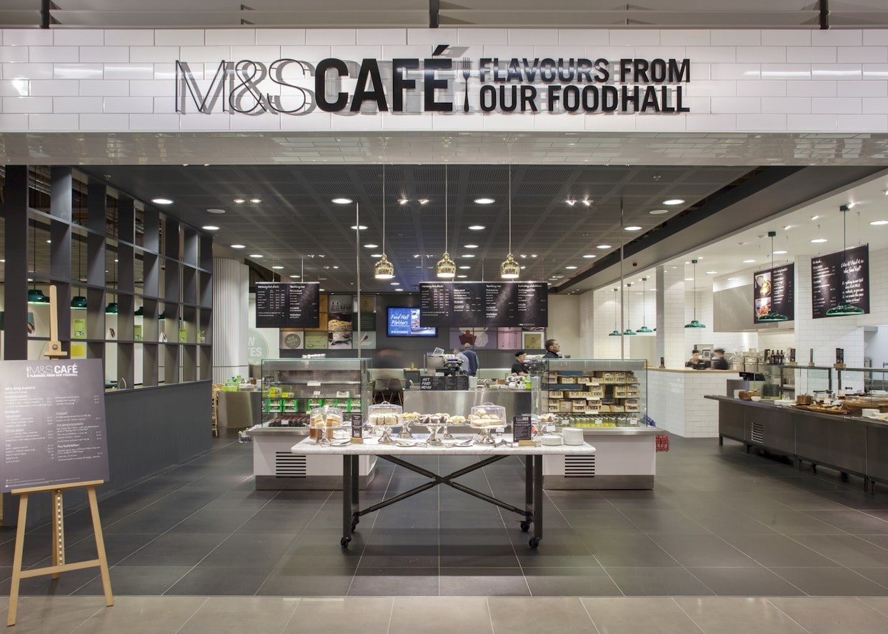
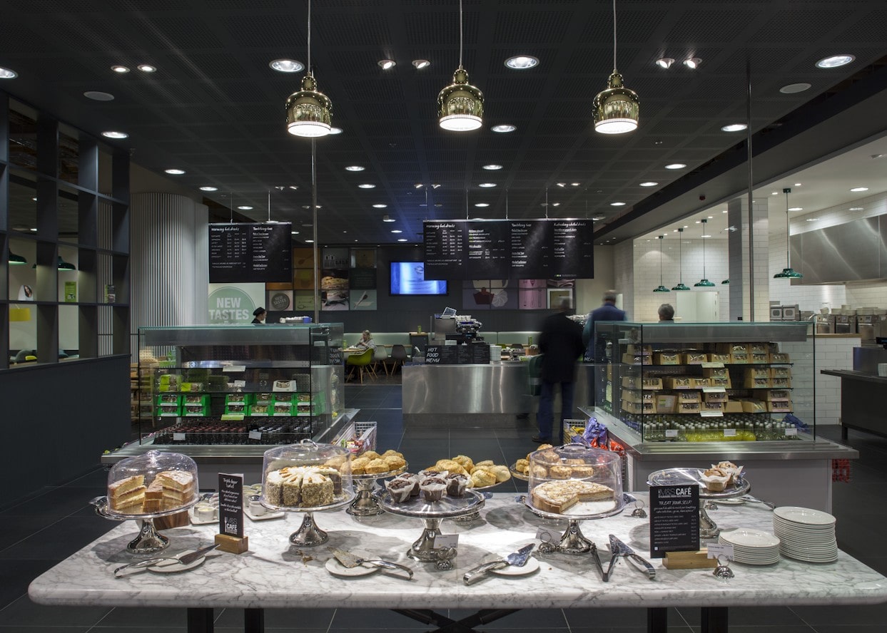
Following the great success of the suspended linear lighting in mainline stores, we turned our attention to their smaller, Simply Food properties. Here, the existing lighting often differed from store to store. We harmonised the lighting in Simply Food, introducing suspended linear LED ambient luminaires, interspersed with LED accent spotlights. The resulting energy savings allowed for rapid paybacks on investments, giving M&S the confidence to use more LED technology in their mainline stores.
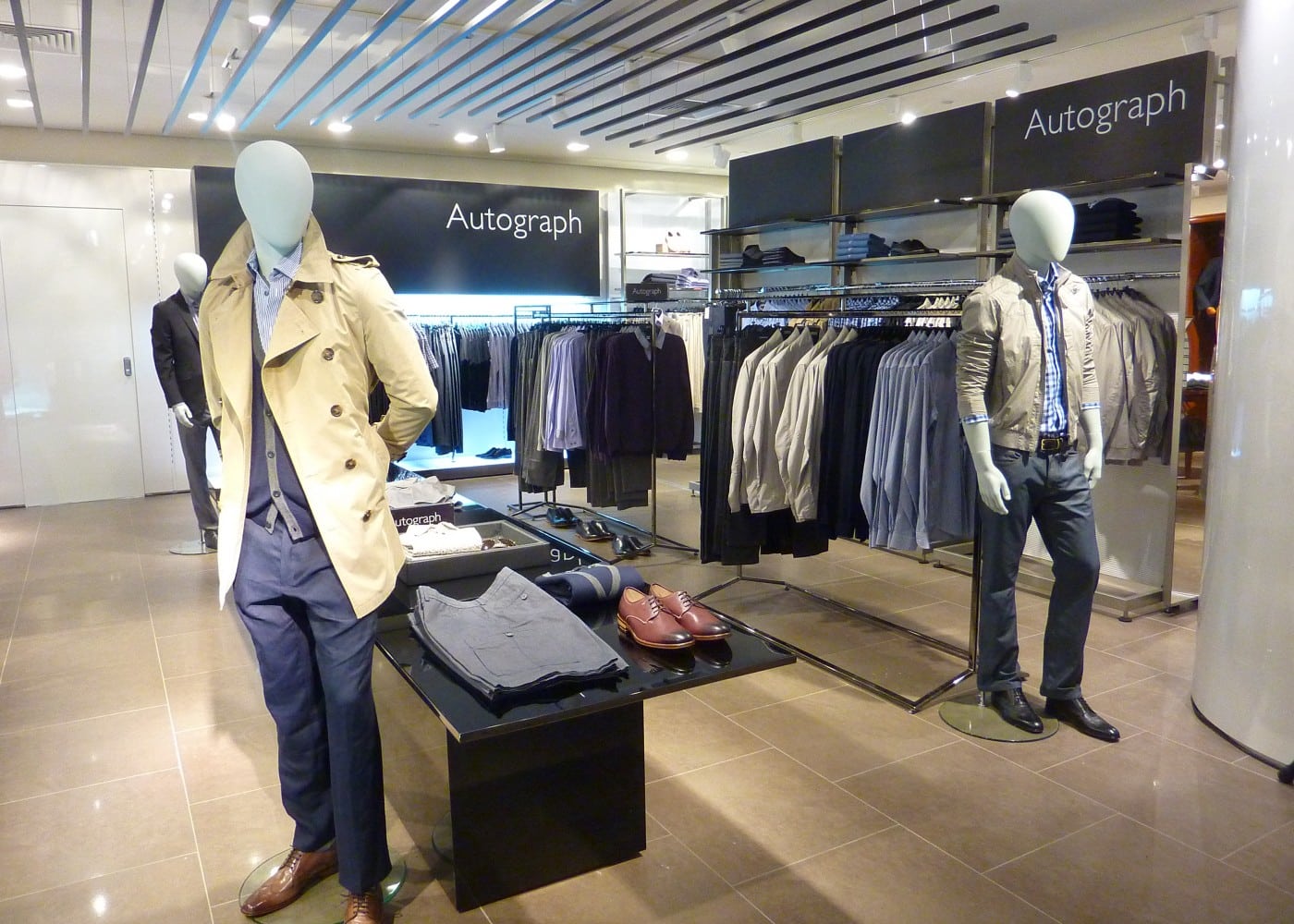
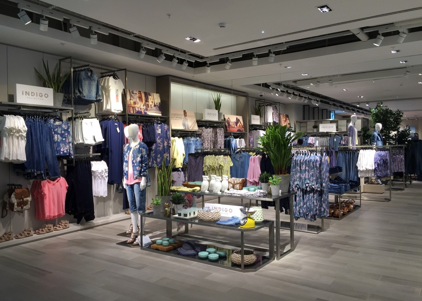
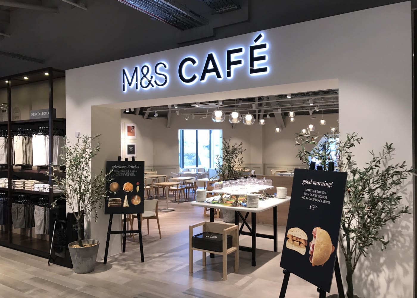
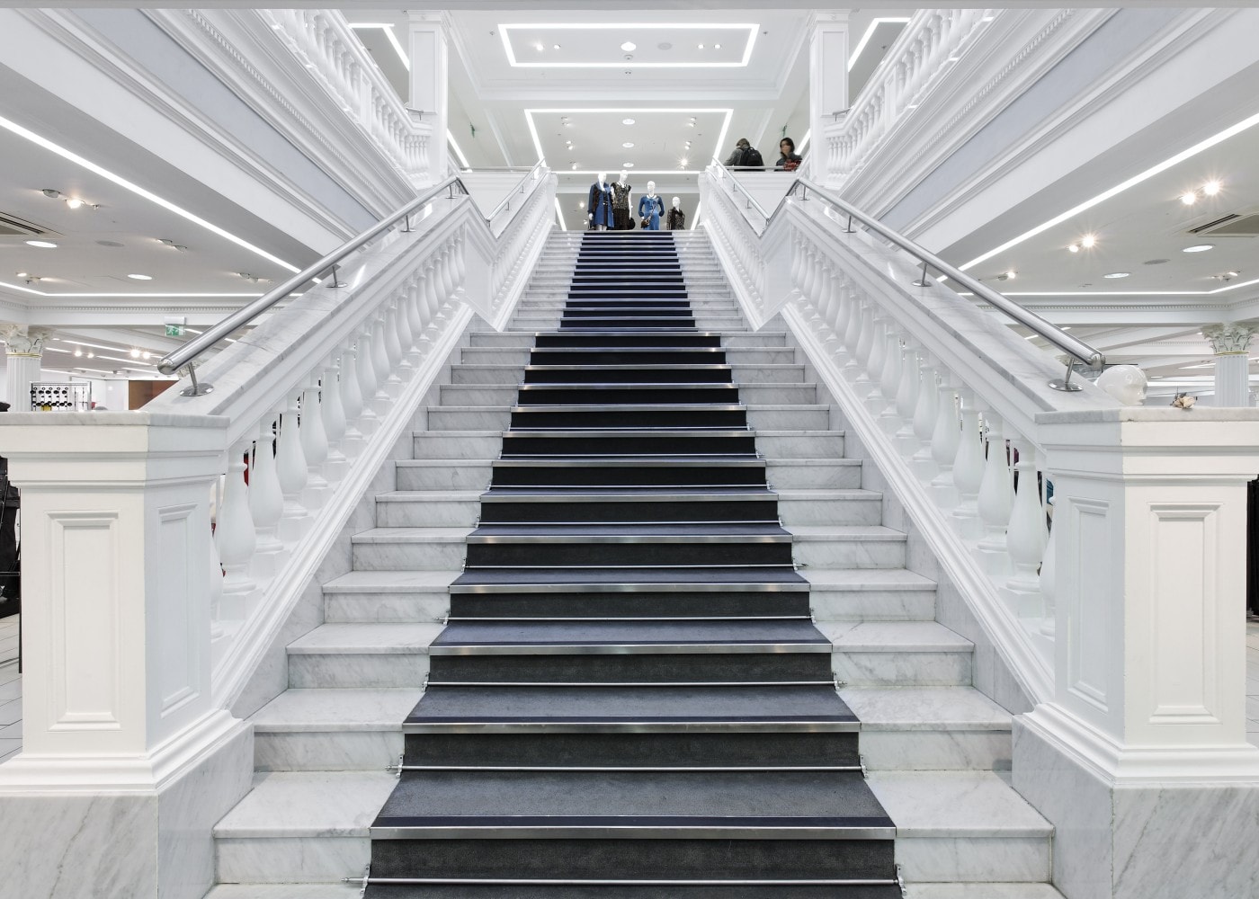
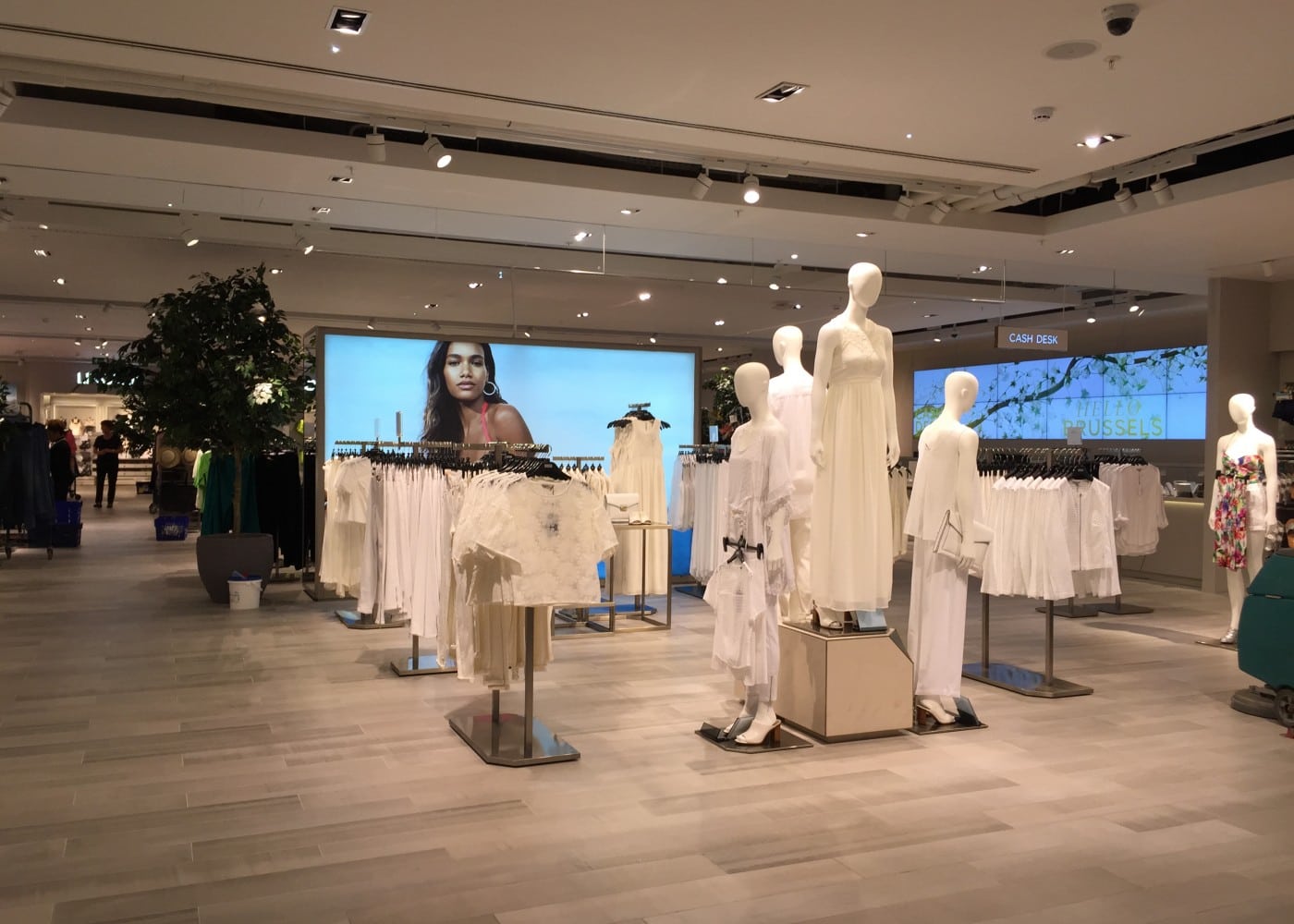
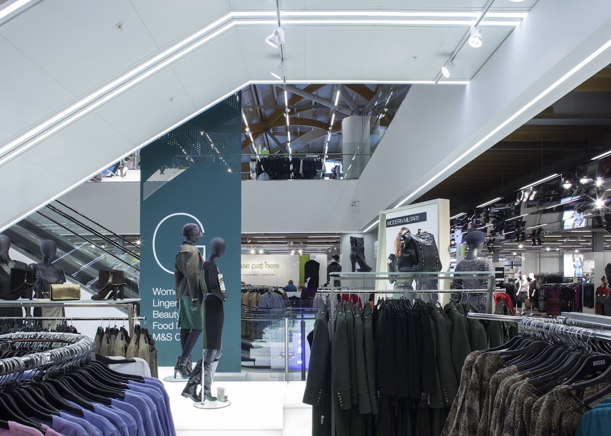
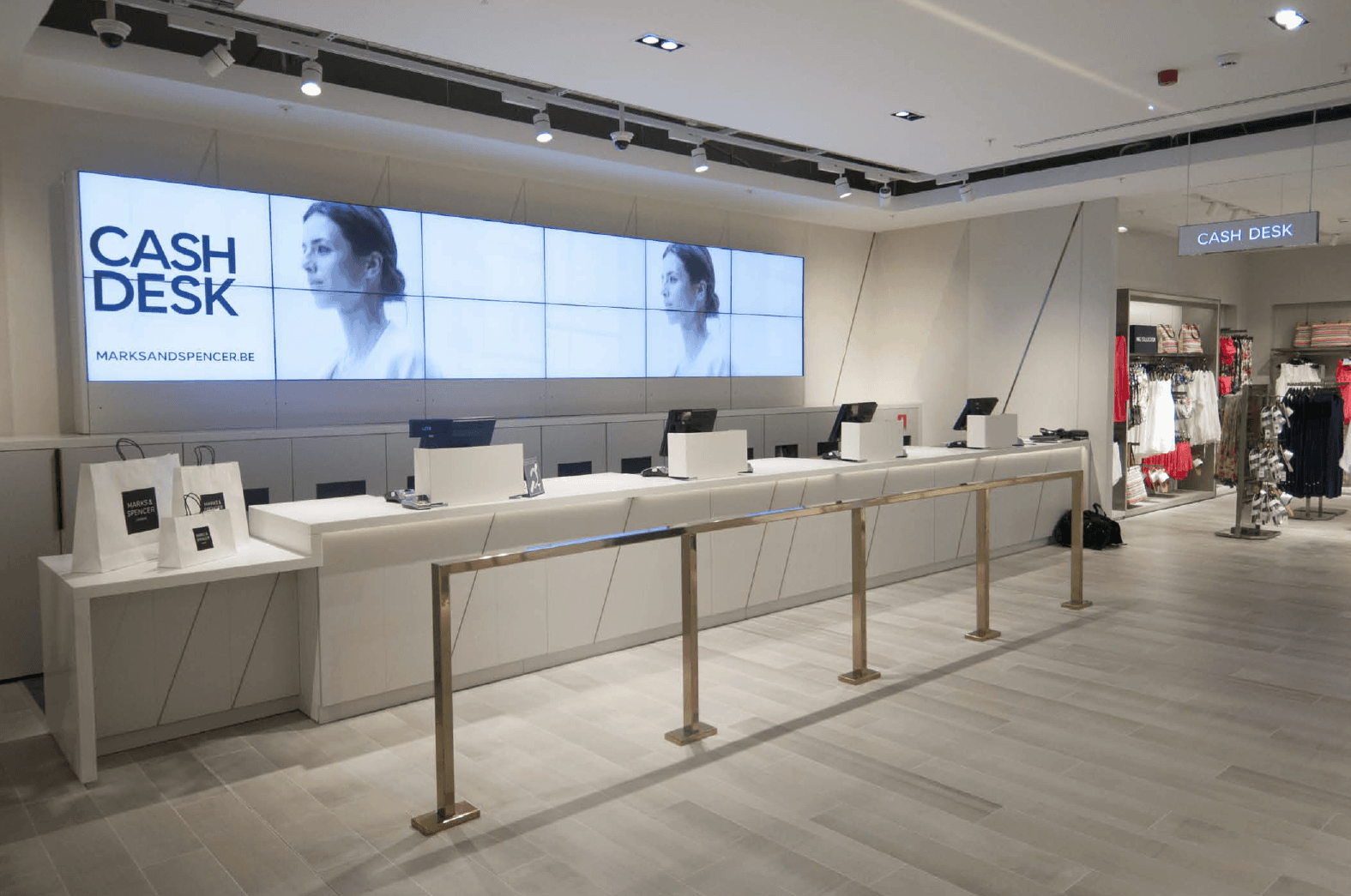
Presently, M&S’s mainline UK stores showcase a sophisticated architectural palette, with an accent-driven lighting scheme improving every facet. Minimalistic linear LED units, mounted to a uniform grid of track and fully dimmable, create a soft base level of light. LED spotlights with precision narrow and medium beam optics deliver accent lighting with minimal glare. Accordingly, the latest stores in the M&S estate are retail destinations, where sublime surface finishes coordinate with a muted colour palette, all enhanced by a precise, flexible and brilliant lighting design.
