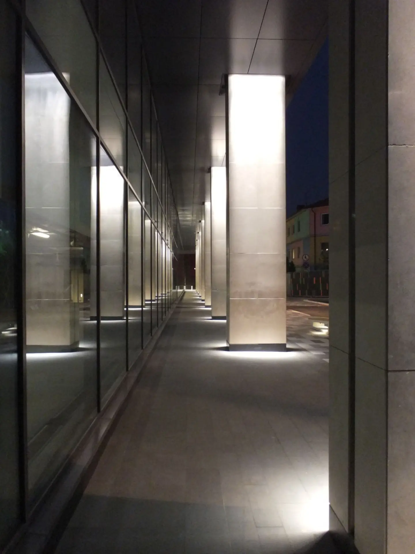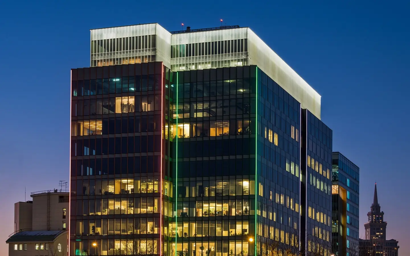
Highlighting all the columns around the base of the building grounded the ‘cage of light’. We added the entrance canopy into this part of the scheme, with a matching cool white light. Using a linear light source, concealed in a detail above the column, emphasised the columns as architectural elements. These linear fittings, using appropriate optics, cast a sheet of light down each column. This therefore avoided downlights visually scarring the canopy above, or creating distractions from the pure forms.
The canopy needed to echo the experience of the building from a distance. Using cool white LEDs, we created a backlit frosted glass canopy. This created a similar level of impact at low level to that created by the lantern from afar.
The lighting treatments around the base of the building balanced the strong lantern effect at the top, but also contributed to the landscaping lighting.
Lighting columns from the Hess City Elements range provided general illumination to the entrance and car parking areas around the building. The columns have a neutral cylindrical form, against which one can view the building without conflict from feature elements. The columns allowed for symmetrical, asymmetrical and road optics, without a change in appearance. They produced a warm and soft level of light with low glare.
Feature lighting was provided to the furniture elements around the buildings. Concealed lines of light, integrated into furniture in collaboration with the manufacturer, create a warm glow under each seating area. Feature lighting was also provided to uplight the trees themselves. Due to the carpet of snow across the landscaped areas each winter, these uplights sit slightly above ground level. This ensures they still provide the right lit effect during winter months. As with all of the exterior lighting products specified, they needed to be able to operate at temperatures down to -40 degrees Celsius. Again, a warm colour temperature harmonises with the lighting elsewhere around the building base, and in contrast with the cool colour temperature on the façade.
Occupants are led from the roadside to the canopy by lines of staggered light recessed into the ground. By mimicking those running down the façade, these lines add a further reinforcement to the overall aesthetic.
Once inside the building these strong linear lines of light flip up onto the ceiling of the reception area to continue the draw into the building. Four continuous lines of light from XAL draw the eye towards the feature wall at the end of the reception space.
This feature wall uses continuous linear LEDs with a 6˚ optic. It grazes light up the back wall, which consists of a suspended horizontal linear mesh. The front of the wall is cast, layered glass orientated horizontally. The resulting moiré effect between the backlit mesh and the front layered glass creates an intriguing shimmer that continually changes with the viewing angle.
Lines of light within each lift lobby continue the theme throughout the building. Floating ceiling rafts, lit on all sides by concealed cove lighting, frame these lines.
The developer moved into the 10th floor and appointed LAPD to illuminate all of their office spaces. Lines of light illuminated the naked concrete surfaces and Italian wooden walls in the reception, waiting and circulation spaces. Square downlights from XAL provide accent light in key places.
Meeting rooms and smaller office spaces use a combination of linear and accent lighting within troughs from Kreon. This allows control to provide bright uniform levels of light for meetings and low levels of accent light for presentations along with options for variations between the two. The linear and accent light match in colour temperature.
Open plan office areas needed good, even illumination and clean aesthetics. Suspended Zumtobel Aero luminaires achieve the desired illuminance levels on the desks and on the ceiling itself.
It was important to ensure that tenants within other floors lit their offices in such a way that the building had a homogenous look at night. So, LAPD wrote a control and lighting strategy to be issued to tenants. This included requirements to conform to different orientations of lighting in different areas but still provide flexibility within their design. The strategy also included a decorative treatment to all interior columns, for all floors.